USA is a country who puts a large importance on food and has a very diverse food culture. We also have that Chicago is one of the most influential cities in the North American country. We want to combine these two insights in order to build an analysis on the food industry as it pertains to Chicago, but with a very specific viewpoint: we will look at how safe is to eat or buy food in Chicago. Specifically, we would like to focus on two main aspects: how can economic prosperity of an area influence in the frequency of inspections and violations, and an in-depth comparison between large franchises and small businesses. We believe that the conclusions extracted from such study will help to better understand this outstanding city. Let’s start off!
Data-set
We used the Chicago Food Inspections dataset dataset containing a list of the inspections of food establishments in Chicago from January 1, 2010 to the present.
Each line of the dataset represents an inspection and gives us information about the establishment itself, the result of the inspection, the violations detected and others.
Below is an example with only the more relevant columns kept:
| Name: Chipotle Mexican Grill |
|---|
| Facility Type: Restaurant |
| Risk: High |
| Zip: 60657 |
| Results: Pass w/ Conditions |
| Violations: |
| 16. food-contact surfaces: cleaned & sanitized - comments: noted a very thick black and slimy substance inside the upper compartment of ice machine dripping onto the ice. Instructed management not to use ice machine until equipment is detail cleaned and sanitize. Priority foundation #7-38-005 |
| 37. Food properly labeled; original container - comments: noted bulk food items stored inside containers at the dry storage not properly labeled. Instructed management that all bulk and working food ingredient containers must be labeled with contents name. |
| 47. Food & non-food contact surfaces cleanable, properly designed, constructed & used - comments: noted foil paper used to line shelves. Instructed to clean and remove all foil paper to prevent hiding places for pest. |
| 55. Physical facilities installed, maintained & clean - comments: noted cracks on floor at the basement dry storage area. Instructed to seal and resurface crack on floor to make them smooth and easily cleanable. |
| 55. Physical facilities installed, maintained & clean - comments: noted stained tiles on walls and ceiling by the 3 compartment sink. Instructed to detail clean and maintain. |
| 58. Allergen training as required - comments: noted certified food managers on duty with no allergen training certification. Instructed management that all food service managers are required to have the allergen training certification. |
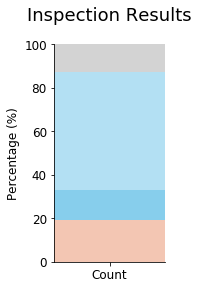
As can be seen most of the data is has results that are either: Pass, Pass w/ Conditions or Fail. We will only be basing ourselves off that data.
There are also many different types of establishment:
- Restaurants make up 67% of the data.
- Grocery stores make up 13% of the data.
- The rest of the data is 20% of the data.
For the purpose of this work we only be considering restaurants.
Part 1: Is richer safer ?
We have compared inspections based on the income for each zip code.
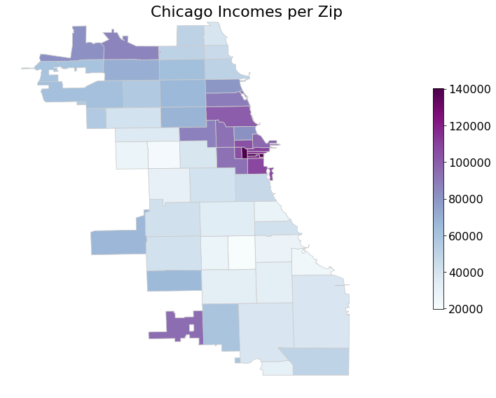
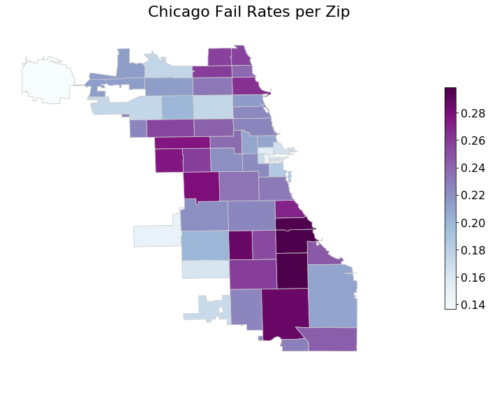
The map on the left shows the income per zip and the one on the right the inspection fail rate per zip. The two maps seem very similar, although inverted. For example, the city centre has areas with very high incomes, but low fail rates. Could there perhaps exist a relation? Let’s plot the trend between income and fail rates!
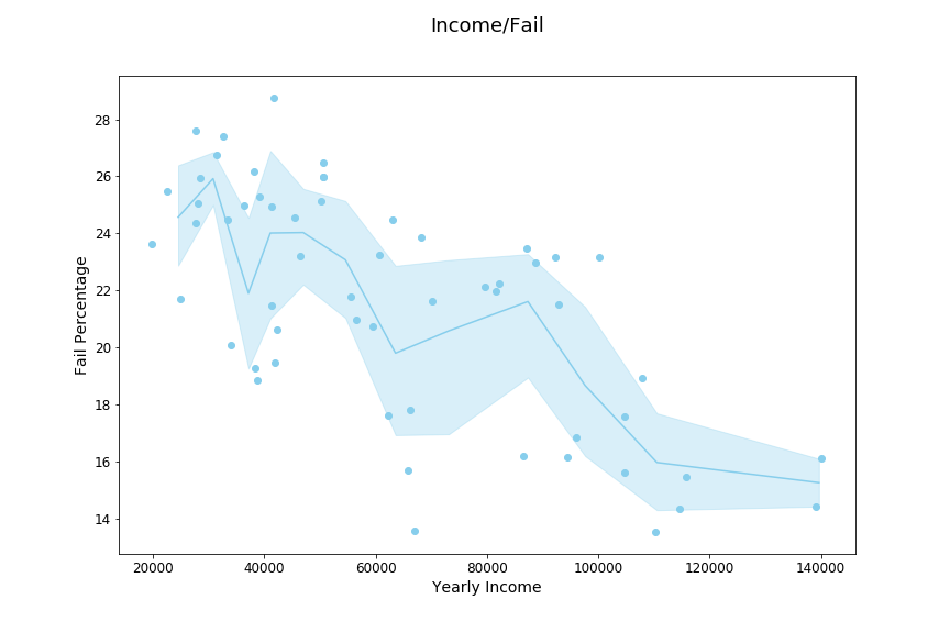
Indeed, a strong negative correlation can be found between income and fail rate. In addition to plotting for each zip code the income against the failure rate, we also binned them into groups of five to do bootstrap sampling, the averages of the bins are then connected with the cone being the 95 percent confidence interval. Besides the large confidence intervals we can still clearly make out a linear relationship.
However, drawing conclusion directly could be a bad idea. One option is that the data is biased.For example, inspectors might be biased against restaurants in low income areas, and target them with more inspections.
Are poorer areas more targeted by inspections?
All establishments have a risk group assigned to them. These risk levels have to do with how risky the kind of food being served is. There are three groups:
- High risk
- Medium risk
- Low risk
We do not look at the low risk group because they are so uncommon that not enough data is available to conclude anything.
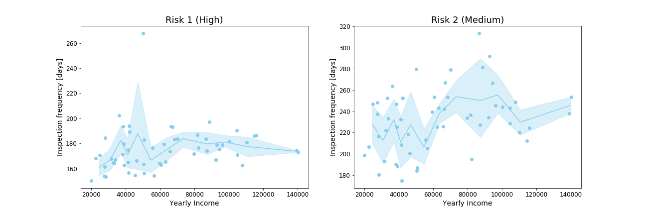
In the graph above we see the average time between inspection per establishment for every zip code. There doesn’t seem to be any clear bias with respect to the inspection frequency.
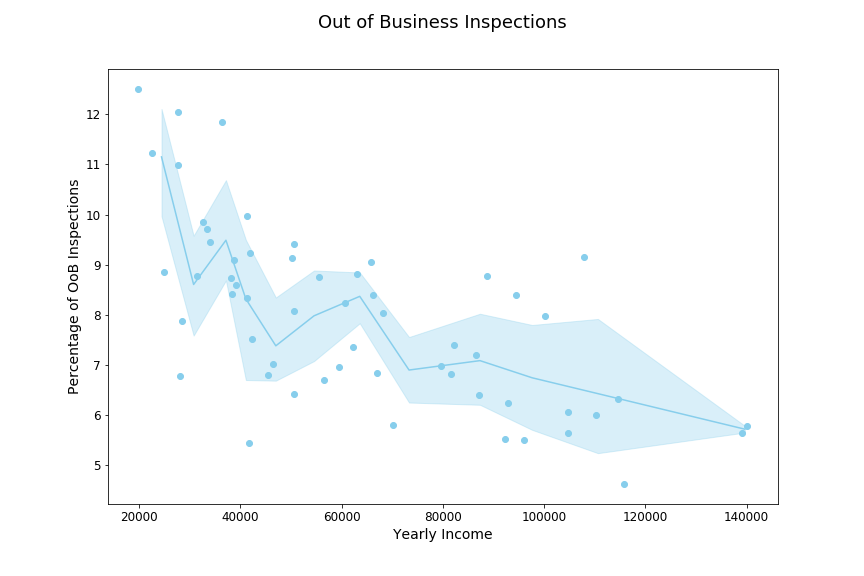
The slightly lower average time for low income neighborhoods might be due to the higher rate of inspections that ended with the result “Out of Business”. The plot to the right shows that restaurants fail more often in low income areas. In poorer neighborhoods running a profitable restaurants seems to be harder.
Since there is no bias to the inspection frequency, we simply conclude that higher income areas are safer, and that a customer grabbing some food in the city center has a lower risk of having a bad time than someone having lunch in the poorer areas.
So, what could be the problem if you would happen upon a failing restaurant? Analysing the violations column will tell us just that.
Checking the specific violations:
We firstly separate the data into two groups:
- the low income areas, the bottom 25%
- the high income areas, the top 25%
We plot the results for the different groups in a bar graph, to re-visualize the difference seen in the trend of the scatter plot.
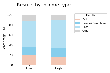
We will slightly quantize the data by setting “Pass” as both “Pass” and “Pass w/ Conditions”, and “Fail” as just “Fail”. The other rows are not connected to the safety of the establishment.
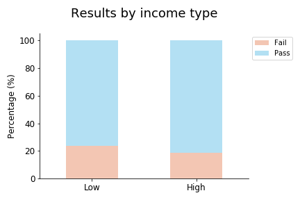
As expected from the scatter plot, high income areas have less failures, and are safer than low income areas. We now use these two groups for the violation analysis. We choose the failure rate as the safety measurement, as a customer going to a restaurant that would fail an inspection is quite unsafe. We use the Fischer exact test, which gives us a p-value lower than 0.01. We can thus deduce from the plots above that restaurants in high income areas fail inspections less often and are safer.
First we quickly see how their inspection results are distributed to get a rough idea about the data. According to City of Chicago, critical violations are numbered 1-14, and serious violations are numbered 15-29. If these are found and fixed during the inspection, the inspection will pass with conditions. Otherwise it will fail. Therefore, we are only interested in the violations numbered 1-29.
The following plot shows the 5 violations that have the largest relative ratio between low and high income neighborhoods. We propose that this will indicate interesting differences in the problems a high income area has versus a low income area.
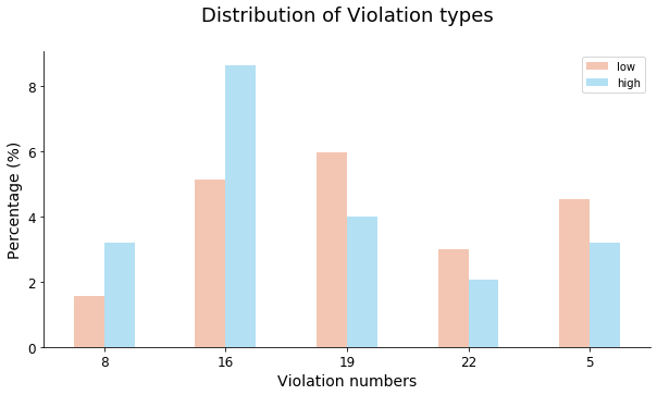
The Violations correspond to:
- Violation 8: Hands clean & properly washed
- Violation 16: Food-contact surfaces: cleaned & sanitized
- Violation 19: Outside garbage waste grease and storage area; clean, rodent proof, all containers covered
- Violation 22: Proper cold holding temperatures.
- Violation 5: Procedures for responding to vomiting and diarrheal events.
By looking at the distribution of violations for these two groups we find a few key differences:
- Low income areas have rodent-related violations more often, as well as with cold temperatures and procedures in case of customers getting food poisoned (hmm?).
- High income areas have more issues with unclean personnel and working surfaces.
We then use an NLP pipeline to extract which words are more common between the high and low income categories. To be able to compare the two categories, we look at the ratio between the relative frequencies. For example, if “mice” makes up 10% of the violation words in low income areas, and 2% in high income areas, the ratio will be 5. We visualize the words with the greatest ratios in the respective categories in word clouds:


As we can see, low income areas have a much greater rodent problem than high income areas, given the great weight of the words “mice” and “droppings”. High income areas have more problems concerning sushi than low income areas, probably due to sushi being a more expensive meal, and sushi restaurants would not be expected to be found in low income areas. Also, this could be related to more strict rules concerning cleanliness in sushi restaurants, which restaurants in high income areas are more likely to violate.
So, we conclude that eating sushi in a high income area might be relatively risky, but you can be almost certain that you will not get any mice droppings on them at least.
Part 2: Are restaurant chains safer than small businesses
The concept of restaurant chains build upon a very simple idea: that you can get the same food regardless of where you buy it. A Big Mac in New York should taste the same as a Big Mac in Chicago. Also, quality between establishments should be the same, since the company has a reputation to live up to. Does this quality extend to food safety? Are there any differences in food safety between small businesses compared to chains?
We extracted the list of food chains from Wikipedia to find all the big restaurant chains in the United states. For the rest of the restaurants, we assume that they are privately owned restaurants with no association to a restaurant chain.
We will do the same quantization as before, and get:
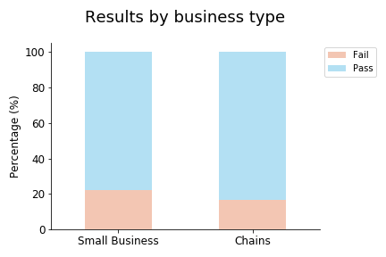
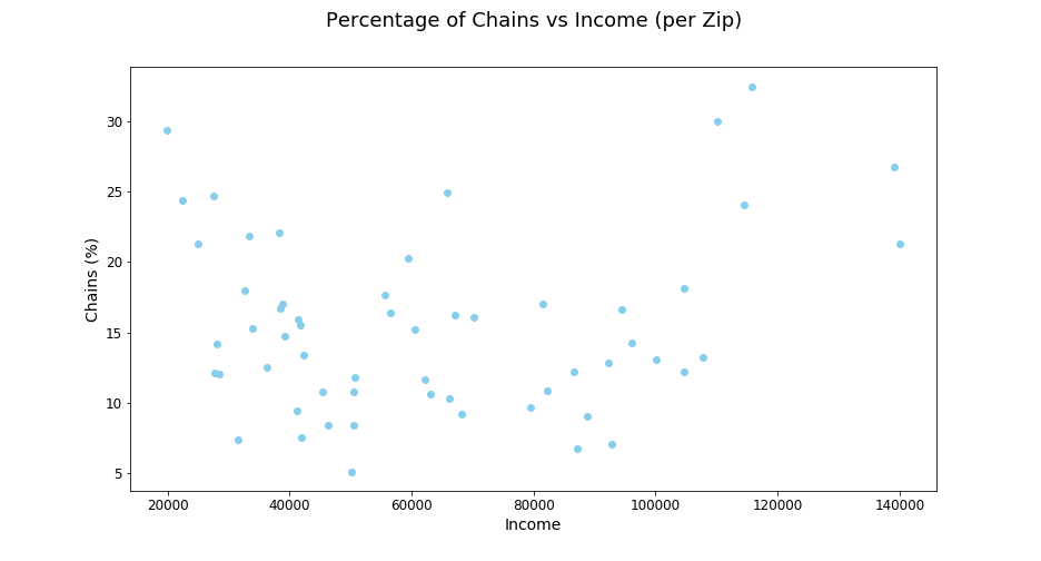 We can see that there is no or a very weak correlation between income chain percentage, and we find a correlation of only 0.14!
For example, the area with the third highest concentration of restaurant chains, has the lowest income. In contrast to this, the area with the fourth highest concentration of restaurant chains has the second highest income!
This disproves eventual thoughts about connections, but to make it even more clear, we will do an in-depth look at the violations for chains and small businesses.
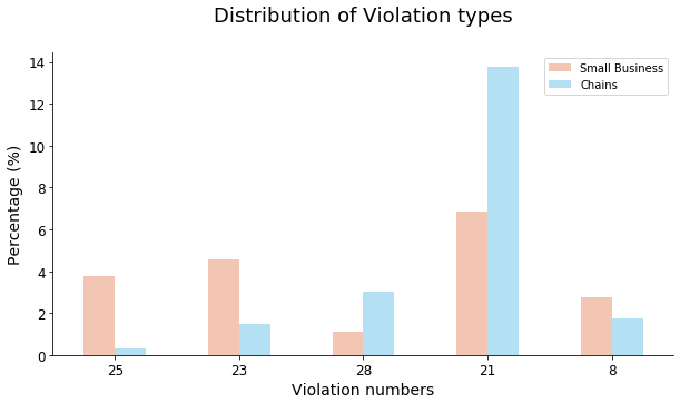
#### Violations between chains and small businesses
We can see that there is no or a very weak correlation between income chain percentage, and we find a correlation of only 0.14!
For example, the area with the third highest concentration of restaurant chains, has the lowest income. In contrast to this, the area with the fourth highest concentration of restaurant chains has the second highest income!
This disproves eventual thoughts about connections, but to make it even more clear, we will do an in-depth look at the violations for chains and small businesses.
#### Violations between chains and small businesses